AE 15: Ice cover in Madison, WI area lakes
The data for this application exercise comes from the lterdatasampler package. The mission of the Long Term Ecological Research program (LTER) Network is to “provide the scientific community, policy makers, and society with the knowledge and predictive understanding necessary to conserve, protect, and manage the nation’s ecosystems, their biodiversity, and the services they provide.”
Specifically we’ll be using data from the North Temperate Lakes LTER (NTL-LTER) site, which is located in the Madison, WI area, modeling the relationship between number of days that a lake is frozen, excluding periods where the lake thaws before refreezing again, and annual average temperature.
Getting started
Packages
We will use the tidyverse package for data visualization and wrangling and the tidymodels package for modeling.
Data
The data can be found in the data folder; it’s called icecover.csv.
icecover <- read_csv("data/icecover.csv")The data dictionary is below:
| Variable Name | Description |
|---|---|
lakeid |
Lake name |
ice_on |
Date of freeze of lake |
ice_off |
Date of ice breakup of lake |
ice_duration |
Number of days between the freeze and breakup dates of each lake |
year |
Year of observation |
annual_avg_temp |
Annual average air temperature (°C) |
Visualizing the model
We’re going to investigate the relationship between ice_duration and annual_avg_temp.
- Create an appropriate plot to investigate this relationship. Add appropriate labels to the plot.
ggplot(icecover, aes(x = annual_avg_temp, y = ice_duration)) +
  geom_point() +
  labs(
    x = "Annual average temperature (°C)",
    y = "Ice duration (days)",
    title = "Ice duration vs. annual average temperature",
    subtitle = "North Temperate Lakes LTER"
  )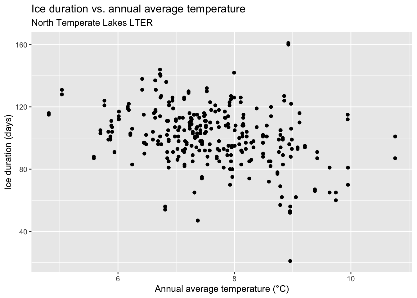
If you were to draw a straight line to best represent the relationship between ice duration and annual average temperature, where would it go? Why?
Now, let R draw the line for you. Refer to the documentation at https://ggplot2.tidyverse.org/reference/geom_smooth.html. Specifically, refer to the method section.
ggplot(icecover, aes(x = annual_avg_temp, y = ice_duration)) +
  geom_point() +
  geom_smooth(method = "lm") +
  labs(
    x = "Annual average temperature (°C)",
    y = "Ice duration (days)",
    title = "Ice duration vs. annual average temperature",
    subtitle = "North Temperate Lakes LTER"
  )
`geom_smooth()` using formula = 'y ~ x'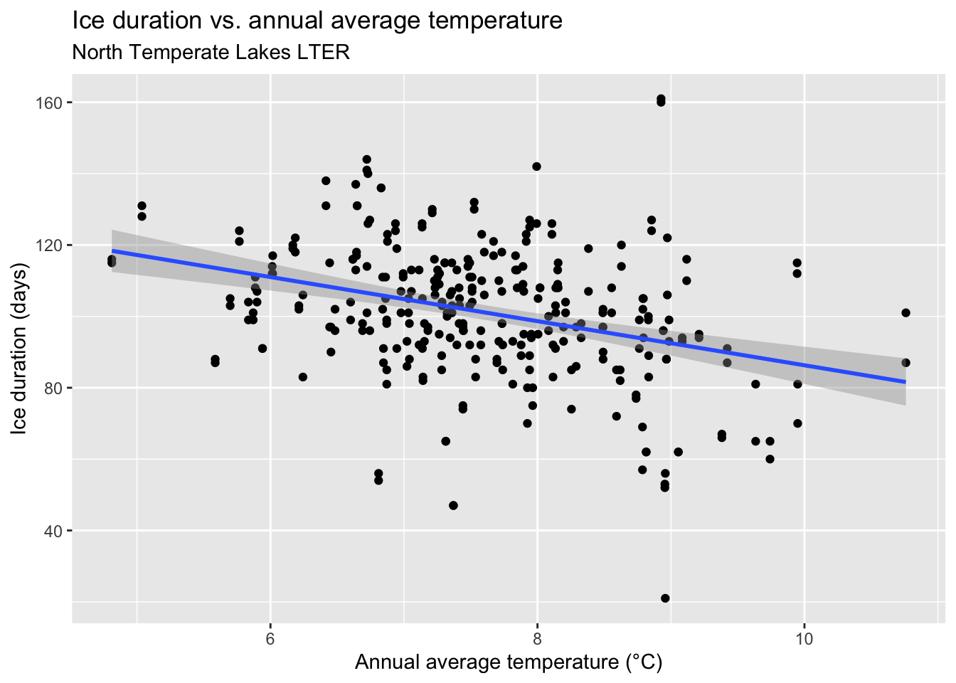
- What types of questions can this plot help answer?
How does ice duration change with annual average temperature? What is the predicted ice duration for a given annual average temperature?
- We can use this line to make predictions. Predict what you think the ice duration would be in a year with annual average temperature of 7, 10, and 12 °C. Which prediction is considered extrapolation?
At 7 °C, we estimate ice duration to be 100 days. At 10 °C, we estimate ice duration to be 80 days. 12 °C would be considered extrapolation because that is beyond the range of temperatures we actually observed in our data.
Model fitting
Fit a model to predict fish weights from their heights.
ice_temp_fit <- linear_reg() |>
  fit(ice_duration ~ annual_avg_temp, data = icecover)

ice_temp_fit
parsnip model object
Call:
stats::lm(formula = ice_duration ~ annual_avg_temp, data = data)
Coefficients:
(Intercept) annual_avg_temp
148.110 -6.182 Model summary
- Display the model summary including estimates for the slope and intercept along with measurements of uncertainty around them. Show how you can extract these values from the model output.
tidy(ice_temp_fit)# A tibble: 2 × 5
term estimate std.error statistic p.value
<chr> <dbl> <dbl> <dbl> <dbl>
1 (Intercept) 148. 7.77 19.1 1.38e-53
2 annual_avg_temp -6.18 1.01 -6.10 3.31e- 9- Write out your model using mathematical notation.
\[ \widehat{ice~duration}=149.11-6.18\times temp \]
Prediction
Before, you used your eyeballs to predict what the ice duration would be in a year with annual average temperature of 7, 10, and 12 °C. Now let’s have the computer do it.
- First, use
Ras an overgrown calculator to compute the model prediction for each of the three temperatures by plugging into your model formulas and doing the arithmetic:
148.109981 - 6.181554 * 7[1] 104.8391148.109981 - 6.181554 * 10[1] 86.29444148.109981 - 6.181554 * 12[1] 73.93133- Second, use the
predictfunction to perform the same calculation. You should get the same numbers (aside from rounding error).
Correlation
We can also assess correlation between two quantitative variables.
- What is correlation? What are values correlation can take?
The correlation coefficient is a number between -1 and 1 that measures the strength and direction of the linear association between two numerical variables.
- What is the correlation between temperature and ice duration?
Fitting other models
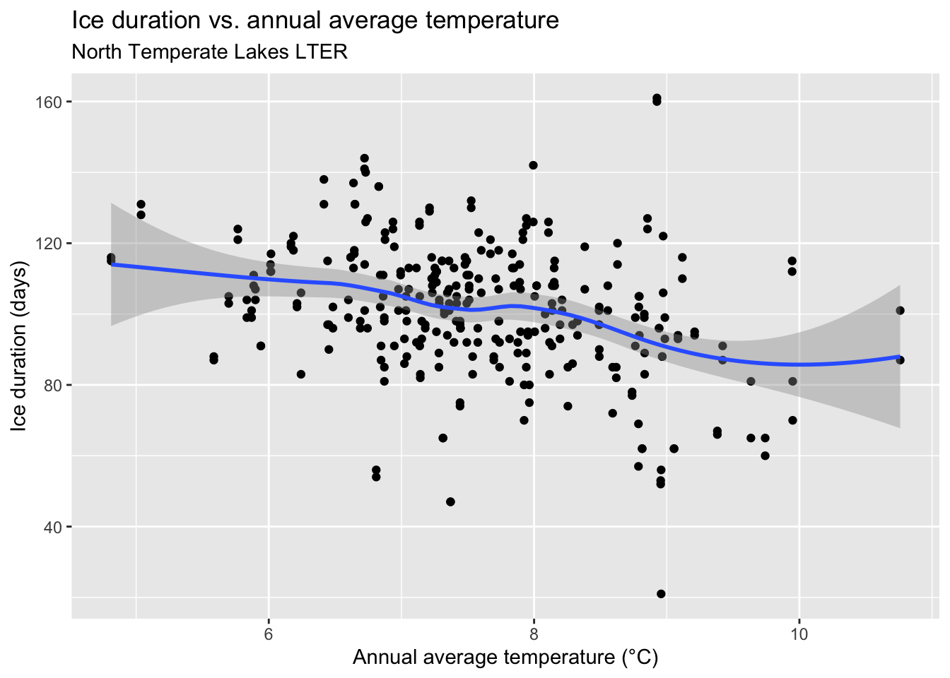
We can fit more models than just a straight line. Change the plotting code from earlier to use method = "loess". What is different from the plot created before?
ggplot(icecover, aes(x = annual_avg_temp, y = ice_duration)) +
  geom_point() +
  geom_smooth(method = "loess") +
  labs(
    x = "Annual average temperature (°C)",
    y = "Ice duration (days)",
    title = "Ice duration vs. annual average temperature",
    subtitle = "North Temperate Lakes LTER"
  )
`geom_smooth()` using formula = 'y ~ x'