Rows: 329 Columns: 1
── Column specification ────────────────────────────────────────────────────────
Delimiter: ","
chr (1): Films

ℹ Use `spec()` to retrieve the full column specification for this data.
ℹ Specify the column types or set `show_col_types = FALSE` to quiet this message.
Code
films |>mutate(Films =if_else(is.na(Films), "(I can't recall)", Films)) |>mutate(Films =fct_lump_min(Films, min =6, other_level ="Other")) |>filter(Films !="Other") |>mutate(Films =fct_infreq(Films)) |>ggplot(aes(y = Films)) +geom_bar(fill ="skyblue") +theme_minimal() +labs(y ="",title ="What's the last film you saw in a theater?",subtitle ="From the sta199-s26 survey",caption ="(Films with fewer than 6 responses were omitted for readability.)")
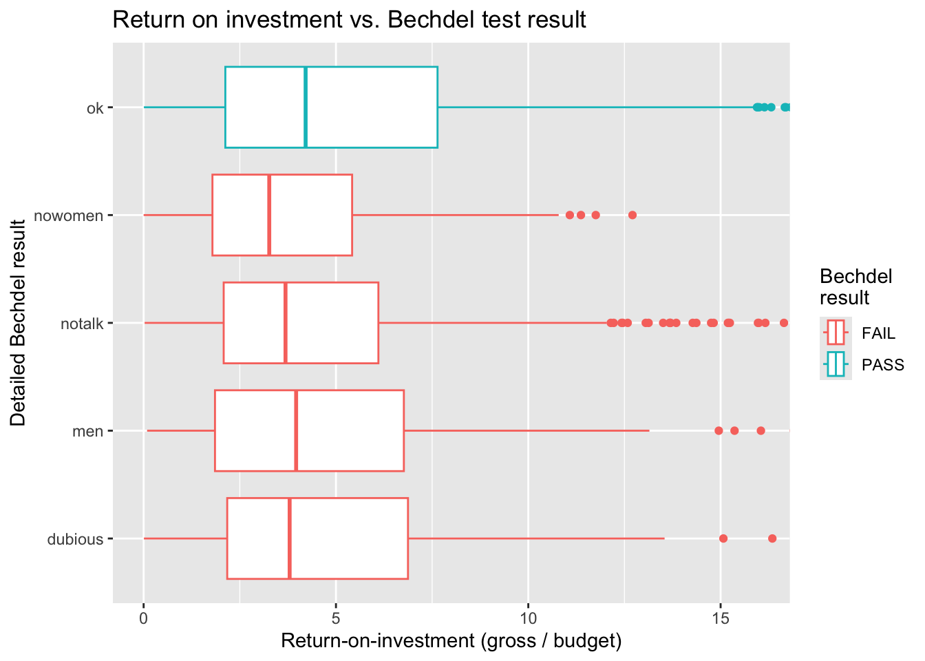
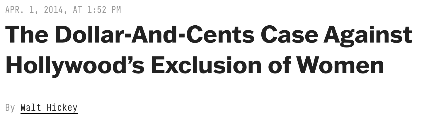
“We did a statistical analysis of films to test two claims: first, that films that pass the Bechdel test — featuring women in stronger roles — see a lower return on investment, and second, that they see lower gross profits. We found no evidence to support either claim.”
ae-03-bechdel-dataviz
Let’s go:
Open your container;
Switch to your ae- project if you’re not already there;
If there are any un-committed changes in the Git tab (upper right), commit them;
The Git tab should now be completely empty;
Lastly, pull the new files I’ve distributed to you.
If that all went smoothly, open the new ae-03-bechdel-dataviz.qmd file.
Recap
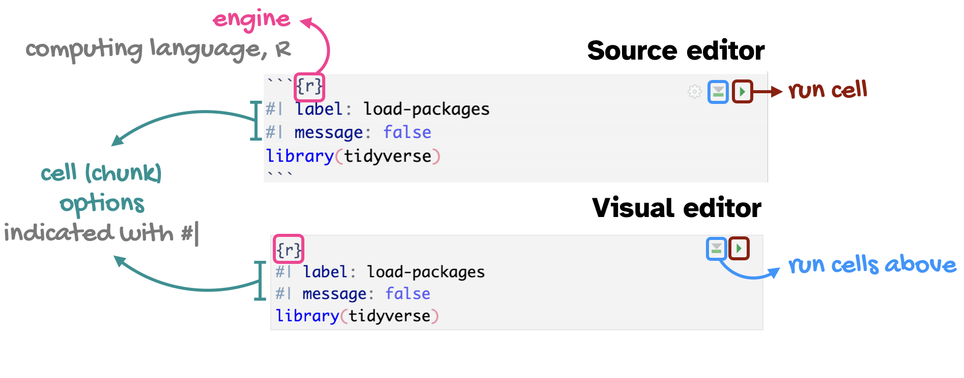
Code cells (aka code chunks)
. . .
Cell labels are helpful for describing what the code is doing, for jumping between code cells in the editor, and for troubleshooting
message: false hides any messages emitted by the code in your rendered document
Describing distributions and relationships
Talking about one numerical variable
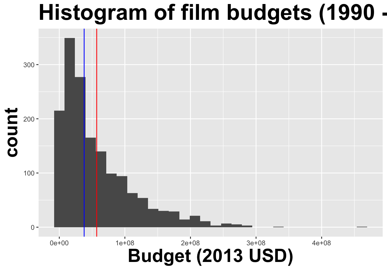
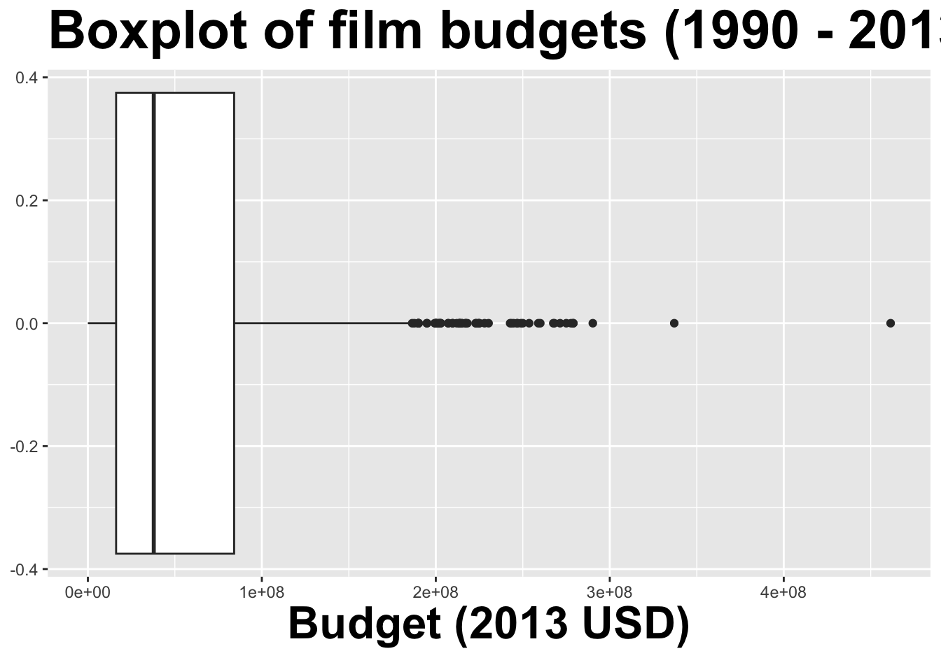
center: what is the “typical” value (mean, median, mode) the data are concentrating around?
spread: how concentrated are the data around a typical value?
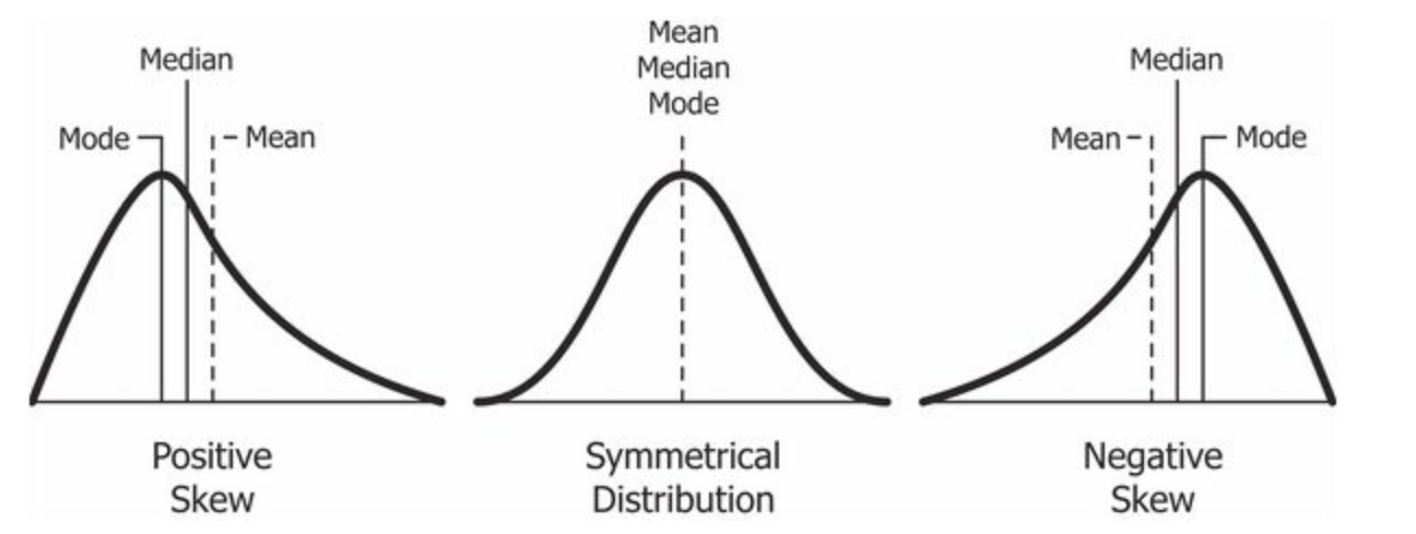
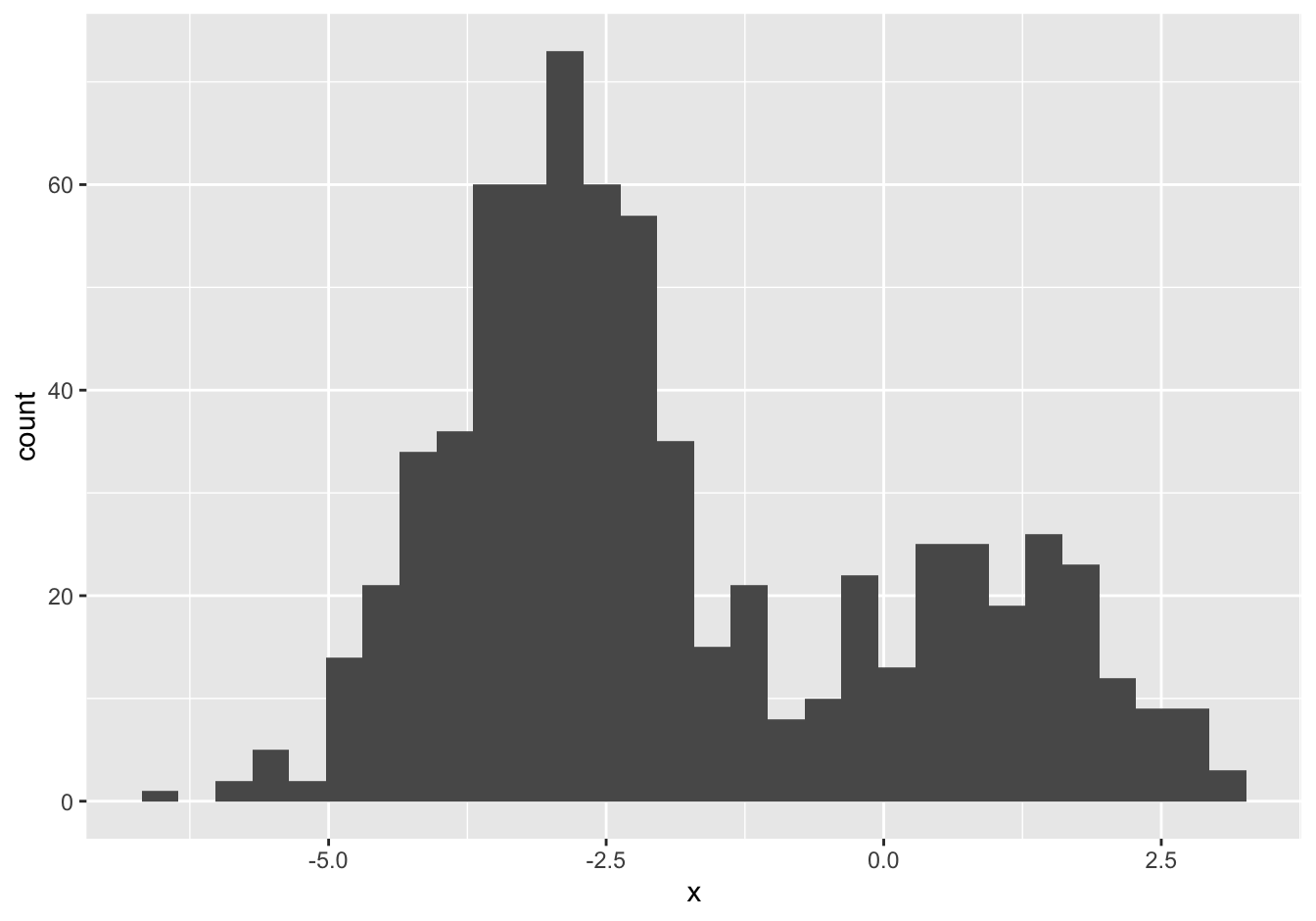
shape: does the distribution have one peak, or many? is it symmetric or skewed?
Interaction between shape and center
If there is only one peak:
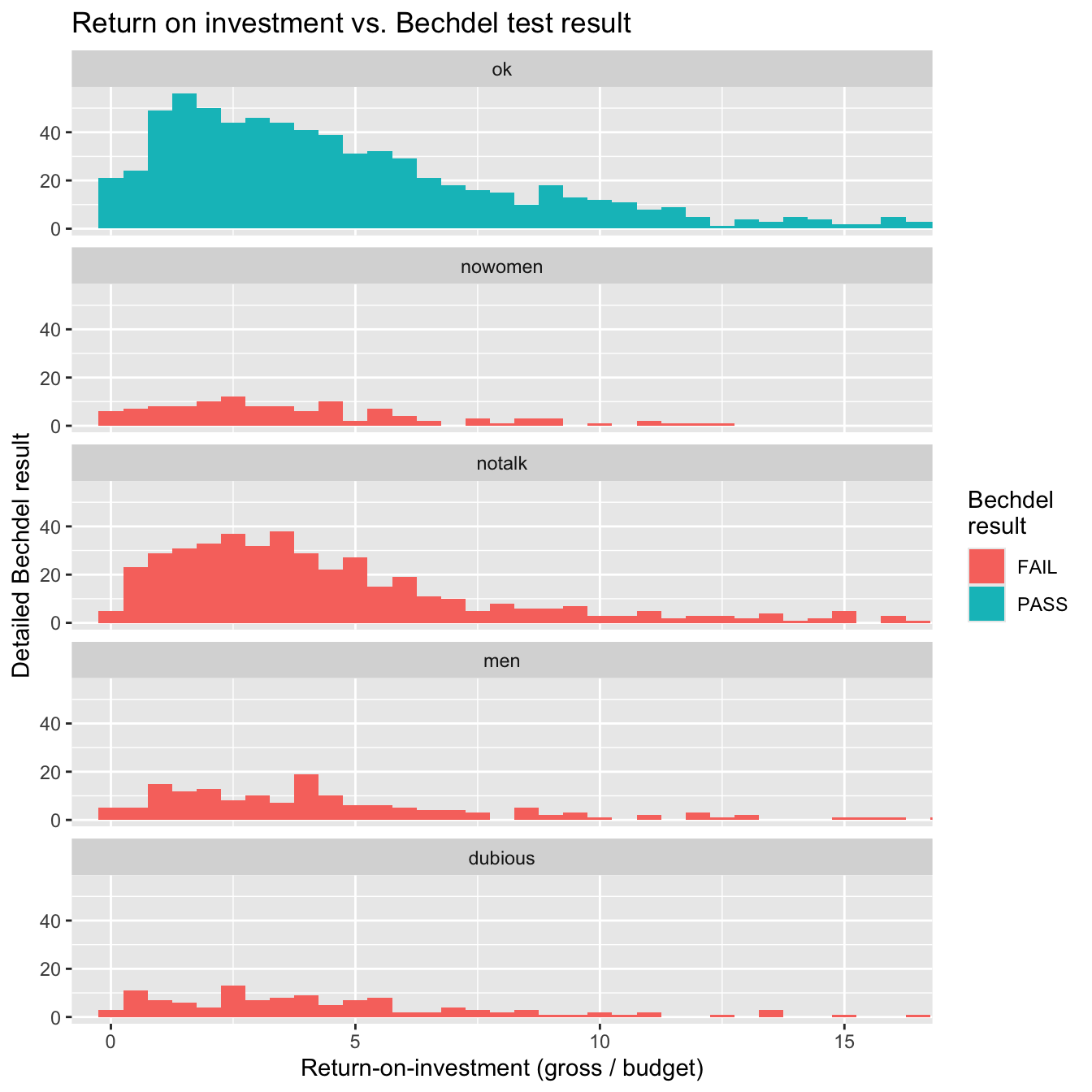
Histograms provide more detail…
Box plots hide multi-modality.
…but boxplots are nicer for side-by-side comparisons, especially with many groups


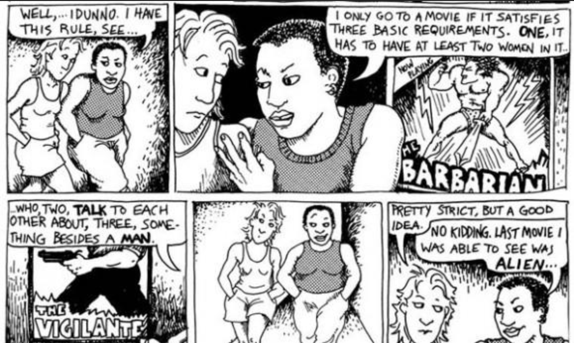 (Dykes to Watch Out For - 1985)
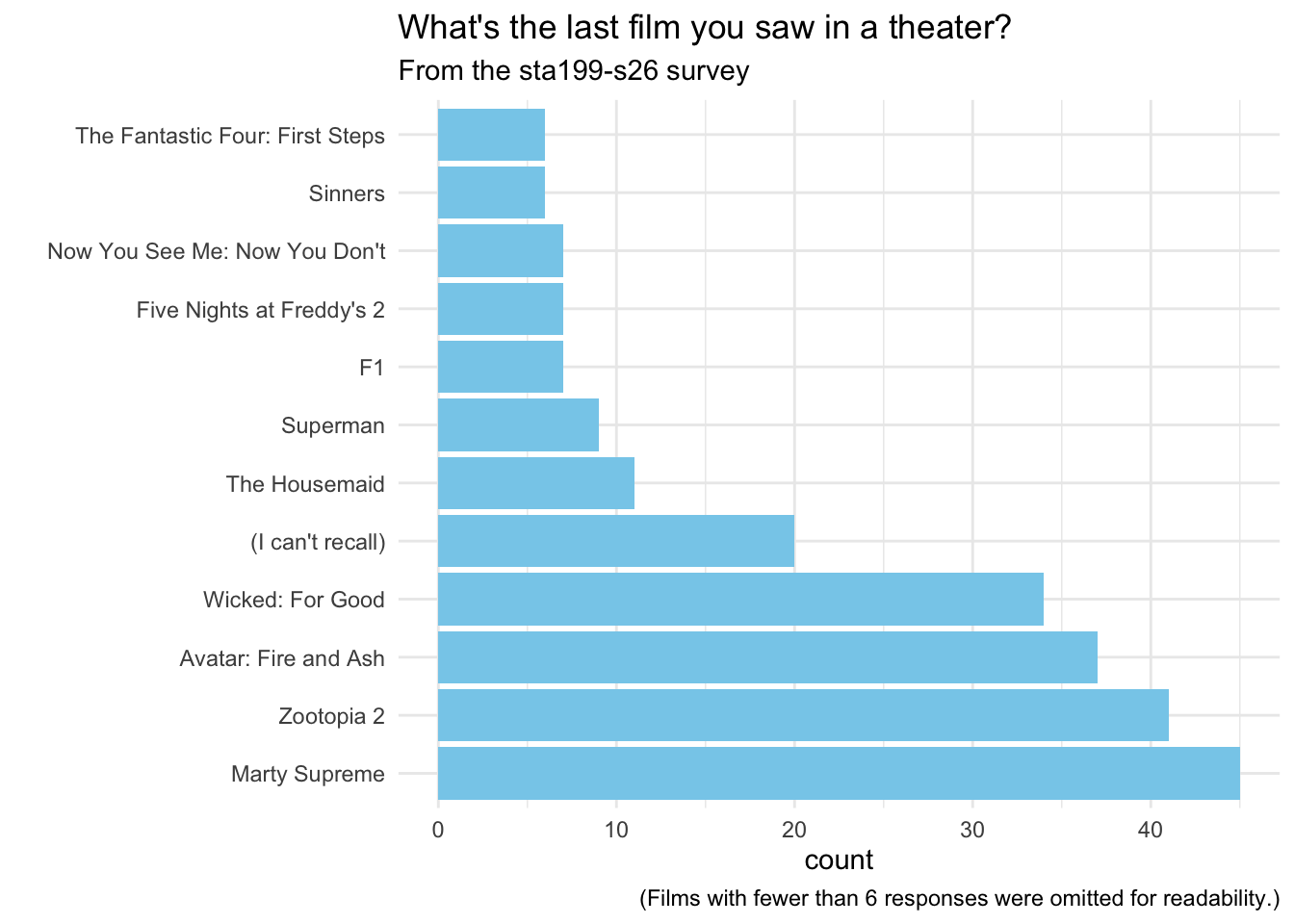
 . . .
. . .