Grammar of data visualization
Lecture 2
Warm-up
Lab tomorrow
What to expect:
- Your first graded assignment;
- We are taking attendance;
- You will work in randomly-assigned teams;
- Each student submits their own work;
- Assignment due at the end of your lab;
- You will have a new repo to clone;
- TA will review setup and workflow (same as we did in lecture this week);
- We know it’s early days. Do not panic about your progress.
Outline
-
Last time:
We introduced you to the course toolkit;
You cloned your
aerepositories and rendered your first Quarto document;
. . .
-
Today:
We will finish the application exercise, and get an introduction to Git, GitHub, and Quarto;
We will introduce data visualization;
Time permitting, we’ll start a new AE to practice.
From last time
Tour: Quarto (and more Git + GitHub)
Option 2:
Go to RStudio and open the document ae-01-income-inequality.qmd.
Tour recap: Quarto
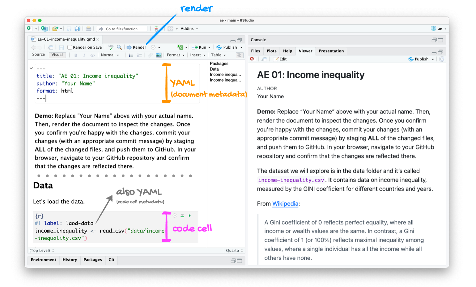
Tour recap: Git + GitHub
Once we made changes to our Quarto document, we
went to the Git pane in RStudio
staged our changes by clicking the checkboxes next to the relevant files
committed our changes with an informative commit message
pulled from GitHub to make sure we had the latest version of our repo
pushed our changes to our application exercise repos
confirmed on GitHub that we could see our changes pushed from RStudio
How will we use Quarto?
- Every application exercise, lab, HW, project, take-home, etc. is a Quarto document;
- You’ll always have a template Quarto document to start with;
- The amount of scaffolding in the template will decrease over the semester.
Data visualization
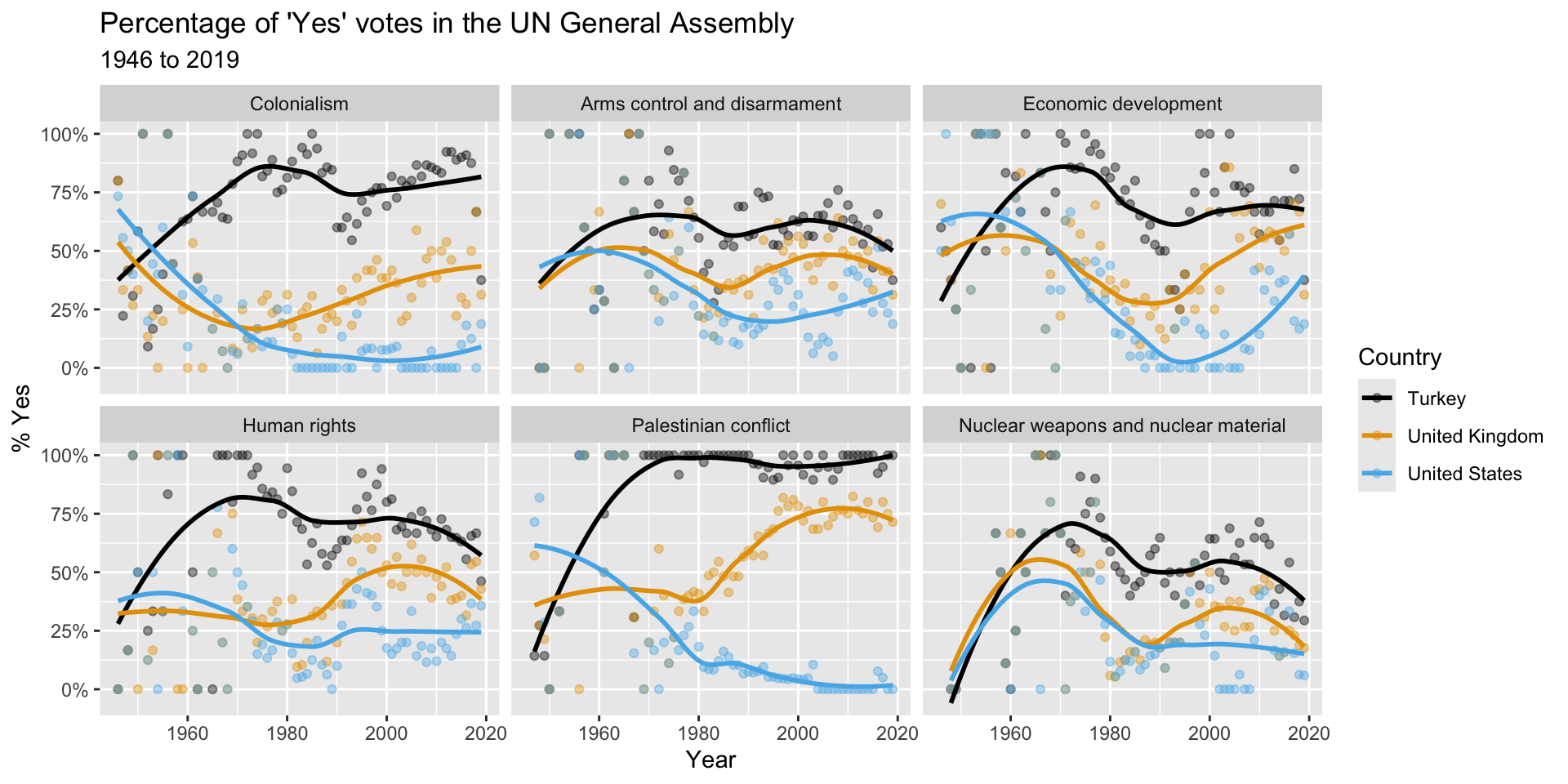
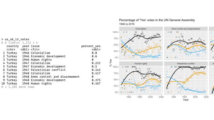
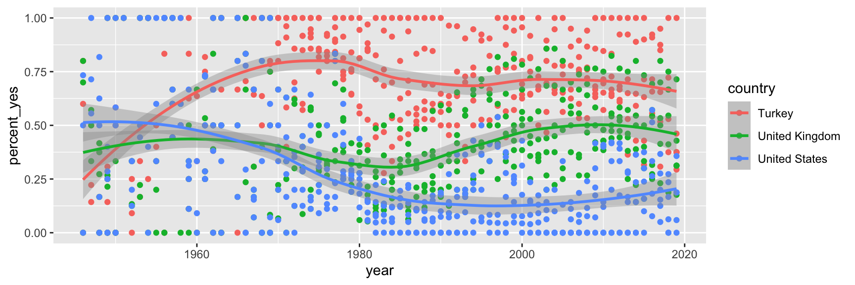
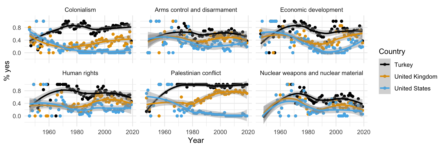
What does this picture communicate?
Remember this visualization from the code along video – what was it about?
Data science lessons
Are you asking a question that your data could actually answer?
- A “Yes” vote is not necessarily an approving vote. It depends how the resolution was worded;
- If your question is “where do countries stand on these issues, both relative to one another and over time,” the picture doesn’t actually have an answer;
- It’s only useful for seeing if countries are in agreement with one another or not;
- Precisely what they are agreeing about is ambiguous.
Data science lessons (continued)
This class is about technique bolstered by good taste.
- The plot is fairly technically sophisticated (lots of moving parts), and it looks rather attractive;
- We certainly want you to learn how to create something like that;
- But after you’re done admiring it, your good taste should kick in;
- Is this picture actually communicating effectively.
Data science lessons (continued)
If a reader has to squint at your picture for more than 30 seconds (and that’s being generous) in order to understand it, you need to start over.
- If you make the reader work too hard, they will take the path of least resistance: skip the picture altogether or default to the most facile interpretation;
- On the UN pic, many reckless readers might assume Yes = Approve and misread.
Let’ see…
how the sausage is made!
Load packages
Prepare the data
us_uk_tr_votes <- un_votes |>
  inner_join(un_roll_calls, by = "rcid") |>
  inner_join(un_roll_call_issues, by = "rcid", relationship = "many-to-many") |>
  filter(country %in% c("United Kingdom", "United States", "Turkey")) |>
  mutate(year = year(date)) |>
  group_by(country, year, issue) |>
summarize(percent_yes = mean(vote == "yes"), .groups = "drop")Let’s leave these details aside for a bit, we’ll revisit this code at a later point in the semester. For now, let’s agree that we need to do some “data wrangling” to get the data into the right format for the plot we want to create. Just note that we called the data frame we’ll visualize us_uk_tr_votes.
View the data
us_uk_tr_votes# A tibble: 1,212 × 4
country year issue percent_yes
<chr> <dbl> <fct> <dbl>
1 Turkey 1946 Colonialism 0.8
2 Turkey 1946 Economic development 0.6
3 Turkey 1946 Human rights 0
4 Turkey 1947 Colonialism 0.222
5 Turkey 1947 Economic development 0.5
6 Turkey 1947 Palestinian conflict 0.143
7 Turkey 1948 Colonialism 0.417
8 Turkey 1948 Arms control and disarmament 0
9 Turkey 1948 Economic development 0.375
10 Turkey 1948 Human rights 0.167
# ℹ 1,202 more rowsVisualize the data
# code to visualize the data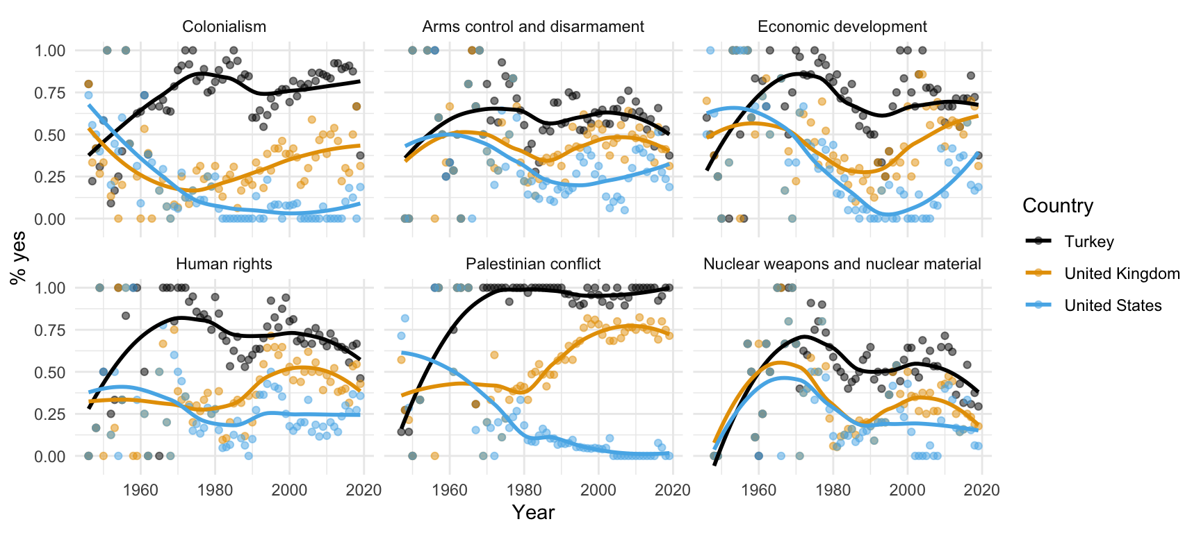
The bottom line, at the top
Each line of code adds an element to the plot.
ggplot(
  us_uk_tr_votes,
  aes(x = year, y = percent_yes, color = country)
  ) +
  geom_point(alpha = 0.5) +
  geom_smooth(se = FALSE) +
  facet_wrap(~issue) +
  scale_color_colorblind() +
  labs(
    x = "Year",
    y = "% yes",
    color = "Country"
  ) +
  theme_minimal()
Let’s take it one line at a time.
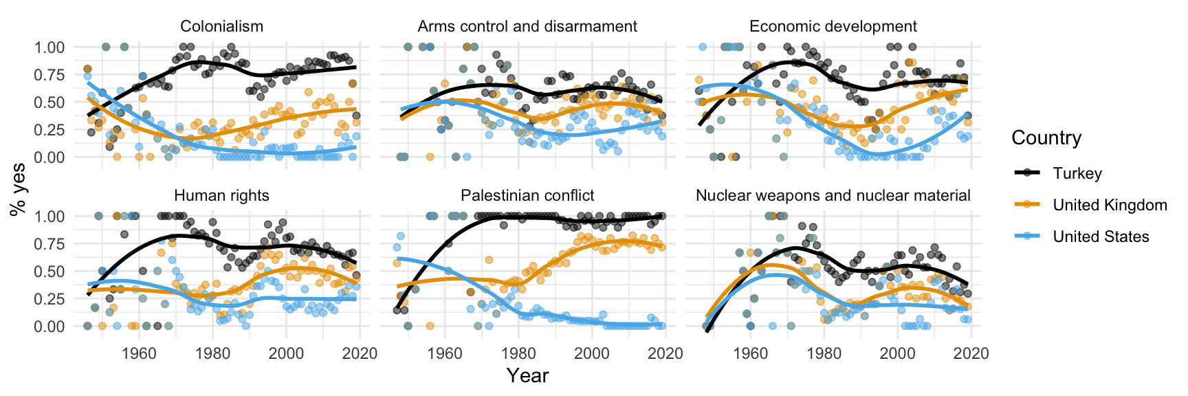
Step 1. Prepare a canvas for plotting
ggplot(data = us_uk_tr_votes)
Step 2. Map variables to aesthetics
Map year to the x aesthetic
Step 3. Map variables to aesthetics
Map percent_yes to the y aesthetic
Mapping and aesthetics
Aesthetics are visual properties of a plot
In the grammar of graphics, variables from the data frame are mapped to aesthetics
Argument names
It’s common practice in R to omit the names of first two arguments of a function:
. . .
- Instead of:
- We usually write:
Step 4. Represent data on your canvas
with a geom
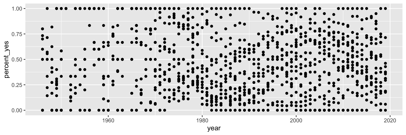
Step 5. Map variables to aesthetics
Map country to the color aesthetic
ggplot(us_uk_tr_votes, aes(x = year, y = percent_yes, color = country)) +
  geom_point()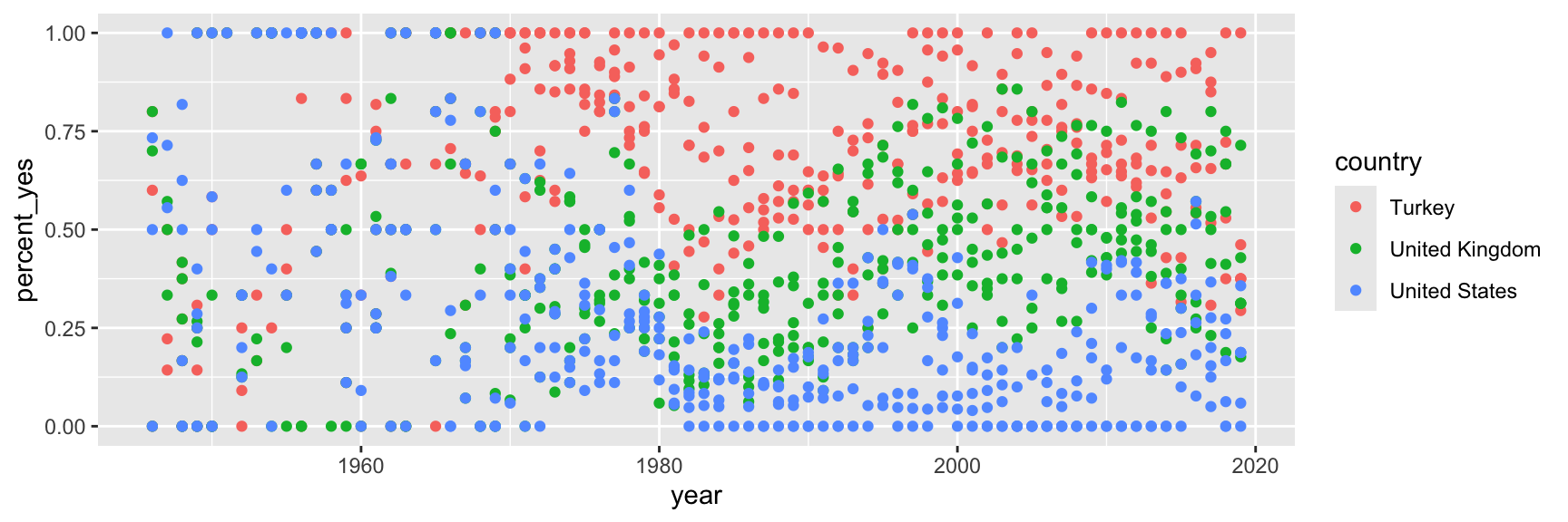
Step 6. Represent data on your canvas
with another geom
Warnings and messages
- Adding
geom_smooth()resulted in the following warning:
`geom_smooth()` using method = 'loess' and formula = 'y ~ x'. . .
- It tells us the type of smoothing ggplot2 does under the hood when drawing the smooth curves that represent trends for each country.
. . .
- Going forward we’ll suppress this warning to save some space.
Step 7. Split plot into facets
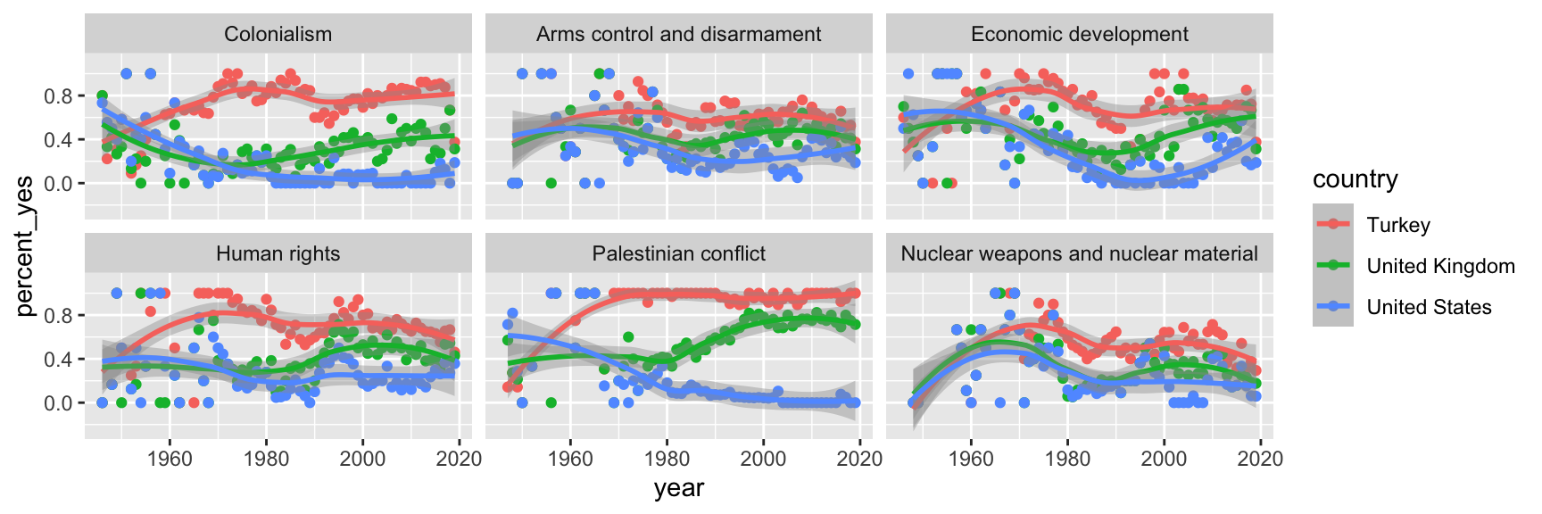
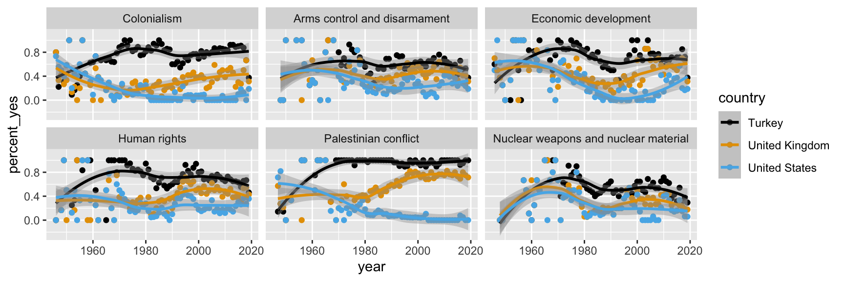
Step 8. Use a different color scale
Step 9. Apply a different theme
Step 10. Add labels
Step 11. Set transparency of points
with alpha
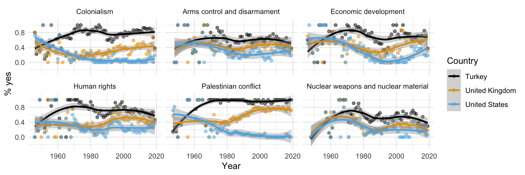
Step 12. Hide standard errors of curves
with se = FALSE
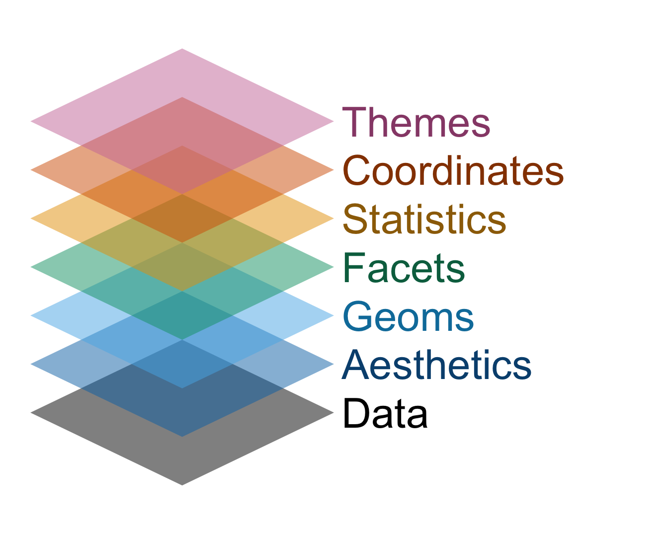
Data viz with ggplot is like building a cake
ggplot(
  us_uk_tr_votes,
  aes(x = year, y = percent_yes, color = country)
  ) +
  geom_point(alpha = 0.5) +
  geom_smooth(se = FALSE) +
  facet_wrap(~issue) +
  scale_color_colorblind() +
  labs(
    x = "Year",
    y = "% yes",
    color = "Country"
  ) +
  theme_minimal()
. . .
The commands are the layers of sponge, and the plus signs are the icing. Don’t forget the icing!
Grammar of graphics
We built a plot layer-by-layer
- just like described in the book The Grammar of Graphics and
- implemented in the ggplot2 package, the data visualization package of the tidyverse.
Now you try
- On GitHub, your AE repo should now have a new file in it called
ae-02-penguin-peekaboo.qmd; - In other words, the remote version of your repo in the cloud (GitHub) has updates that your local repo (container) does not yet have;
- So pull them!